WCAG 2.2: 9 New Updates for Website Accessibility

On Oct 5th, 2023, The Web Content Accessibility Guidelines (WCAG) were updated to version 2.2, the next stage in Accessible Website Design. Many of the new requirements deal with issues other than vision, they deal with cognitive and motor control issues for people that may not process information the most common way, or lack the ability to make small, fine, movements with their hands.
New WCAG 2.2 Accessibility Guidelines:
Level A Compliance
Consistent Help (3.2.6)
This requirement is about providing general help information such as your phone number, email address, chat window, and so on, to be placed in the same location everywhere that it is placed.
If you provide a phone number in the header of your website, it should appear in the same place on every page where it is displayed. There is no requirement to place the information, just that if it is placed, it be placed consistently.
This is helpful for all of your users, but may be of extra help to users with memory impairments or with cognitive impairments.
Redundant Entry (3.3.7)
This requirement is about not forcing users to re-enter information that they have already entered within the same process.
For example, if you have a form that the user fills out, you should not be asking for the same information in multiple locations. Things such as their name or address. Think about a checkout form where someone enters their billing information and then requires them to enter their name and address again if the shipping address is the same as the billing address. This data should auto-populate in the form, or allow for a method to easily replicate the data as you see with the checkbox saying that your shipping address is the same as your billing address.
This is good for all of your users, but can be more important for users with cognitive issues.
Level AA
Focus Not Obscured - Minimum (2.4.11)
This requirement relies on having focus elements not be obscured (covered) when they receive focus. This sounds strange but is easy to understand.
Assume that you have a sticky header that is popular on many websites. When you scroll down the page the header, or sidebar, or popup, or some other element remains in place. This becomes a failure issue when someone tabbing through the page finds that the focus element, usually a button or link, is now 100% covered by the sticky element.
There are several exceptions to this rule:
- If the obscuring element is semi-transparent so that the focus element is still visible.
- If the focus element is still at least partially visible.
- If the obscuring element has been put there by the user (draggable elements)
- If the obscuring element is opened by the user, but should be closable using the <esc> key, or some other method, that does not move focus.
Dragging Movements (2.5.7)
2.5.7 requires that draggable elements have an alternative method of movement. Many users with fine motor control issues, dragging and dropping, drag sorting, and other tasks where a mouse is used to move an element, struggle with the ability to drop the element in the proper location.
For example, assume that you are re-ordering a menu list. Each menu item should have an up/down ‘button or link’ so that the user can move that element with their keyboard or with a single mouse click rather than forcing the click, hold, drag, and then release the menu link in the proper spot.

Target Size - Minimum (2.5.8)
For people who develop for mobile, this is a common issue that they are fully aware of. Any element that is a target, a link, a button, and so on should have a minimum size of 24x24 pixels.
Additionally, target minimums should never overlap. This is incredibly common in mobile devices where you try to click a tiny X and end up clicking something else entirely. Bad actors take advantage of this issue to get you to click on ads that you had no intention of clicking on.
This requirement is very important to users with fine motor control issues.
Accessible Authentication - Minimum (3.3.8)
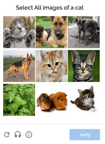
The dreaded obfuscated text captcha is a prime example of an element that is a violation of this requirement, and so are most cognitive tests such as solving a math problem. Some users with cognitive issues cannot solve these authentication barriers.
However, tests that ask you to identify common objects are acceptable. Also, requesting user entry of known items such as their name or email address are acceptable.

Level AAA
Focus Not Obscured - Enhanced (2.4.12)
2.4.12 is the enhanced version of 2.4.11 above. While the AA level requirement allows for a focus element to be partially obscured, Level AAA fails if any part of the element is obscured.
No transparency, no partial elements, and no exception for movable or dismissible content.
Focus Appearance (2.4.13)
The Level AAA focus appearance requirement deals with the contrast between focused and unfocused states. This adds a minimum level of contrast.
For example, if a button has a green border and the focus (hover) state has a blue border, the difference must have a contrast of 3:1 or more. Additionally, the focus indicator, border in this case, must be at least 2 pixels wide. And even more additionally, the focus colors must still meet the contrast requirements for the background that they are on.
One solution to this is to add an offset [outline-offset] to push the focus border away from the unfocused border. But, again, it must still pass the contrast ratio for the background at 7:1 for Level AAA.

Accessible Authentication - Enhanced (3.3.9)
Requirement 3.3.9 is the enhanced requirement of the Level AA Accessible Authentication. This includes the AA requirements, but does not allow for object recognition tests or personal content.
How Can Web Narwhal Help You?
Website Accessibility Design Support and Audits
Web Narwhal is always available to help with your accessibility issues, on either a new site we build for you, on your existing website, or just preparing an Accessibility Policy for you. Contact us with your needs and concerns and we will help you find a solution that is right for you, your company, and your clients.


